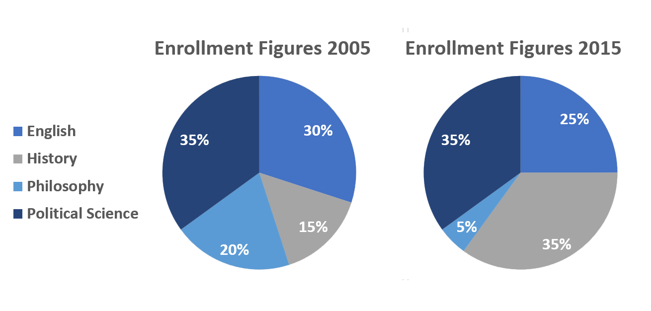
Pie Charts: Course Enrollment for 2005 and 2015
WRITING TASK 1
You should spend 20 minutes on this task.
The pie charts give information about enrollment figures for four subjects in 2005 and 2015.
Summarize the information by selecting and reporting the main features, and make comparisons where relevant.
Write at least 150 words.

The pie charts give information about the proportion of students who matriculated in 4 different courses for the years 2005 and 2015. In general, there were significant changes in the proportion of students enrolling in philosophy and history courses while there were little to no changes in the percentage of students who enrolled in English and political science. It can also be seen that history was the most popular course over the whole period.
With regards to the most popular course, Political science was the most popular in 2005, accounting for 35% of all enrolments and remained unchanged ten years later in 2015. The second most popular course in 2005 was Philosophy which had just 5% fewer enrolees than English. In 2015, however, the figure had decreased to just a quarter of total enrolment, making it the third most popular course.
Turning to the least popular courses, history had the smallest number of enrolled students in 2005, constituting just 15% of total enrolment. Enrolment in philosophy was slightly higher, making up a fifth of all enrolments. By 2015, history was significantly more popular, with enrolment figures equal to those for English. On the other hand, the popularity of philosophy has decreased further, with the figure four-times smaller than it was in 2005.


Responses
Here you can provide helpful feedback, advice, and compliments about this report.
We suggest that you consider the following questions in your response...
Task Achievement
- Did the student summarize the diagram in the introduction?
- Did the student describe the key features of the chart?
- Did the student compare information the charts?
- Did the student provide appropriate details and figures?
Coherence and Cohesion- Did the student use paragraphs and were the paragraphs logically ordered?
- Did each paragraph have a clear purpose?
- Did the student use a variety of linking language?
Grammatical Range and Accuracy- Did the student use appropriate tenses, clauses, and other structures?
- Were there any mistakes in the structures?
- Was there a variety of structures?
Lexical Resource